Petrichor × Word Woes IV
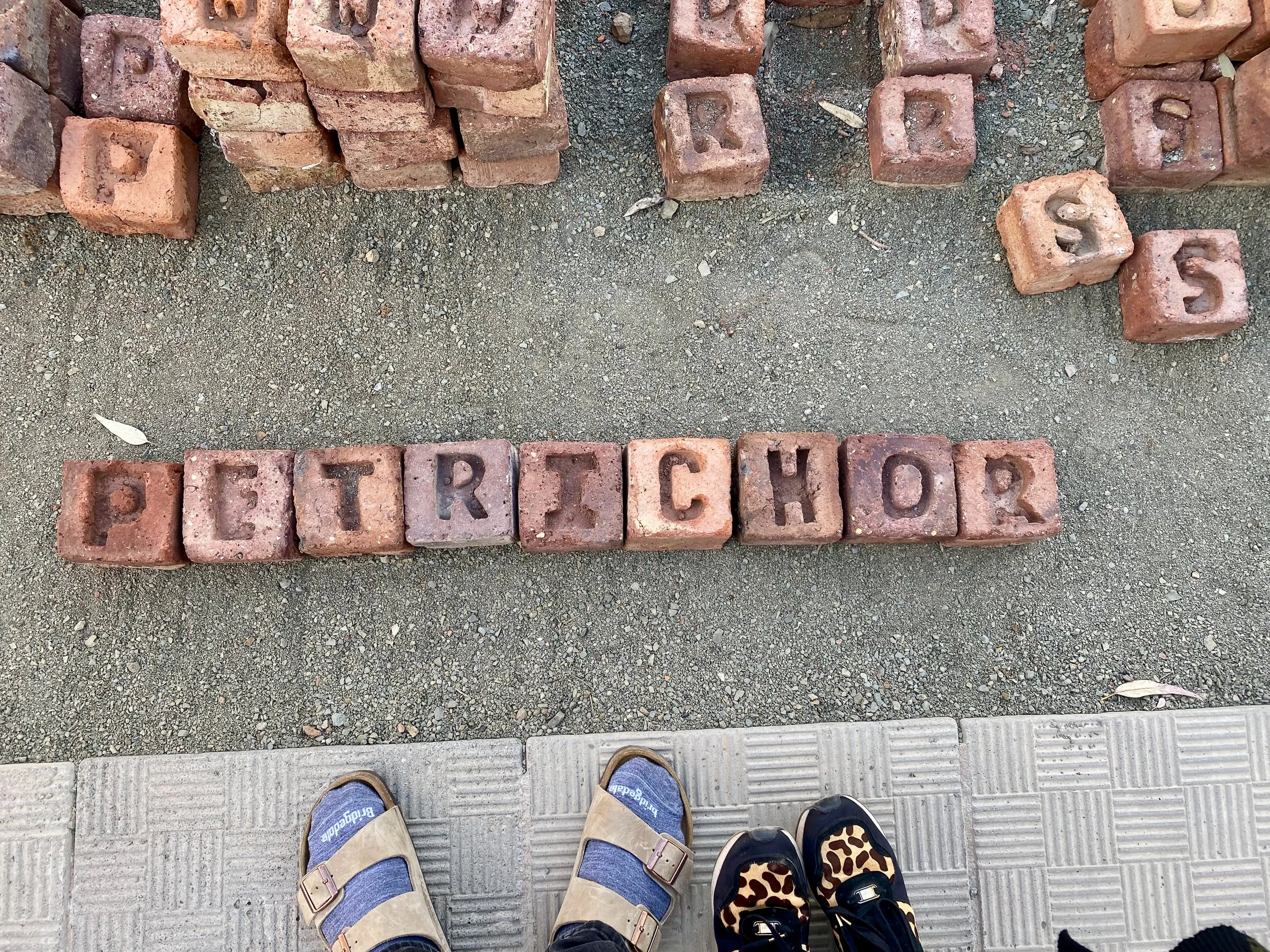
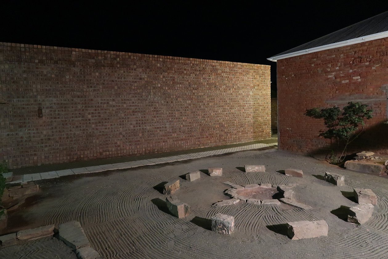
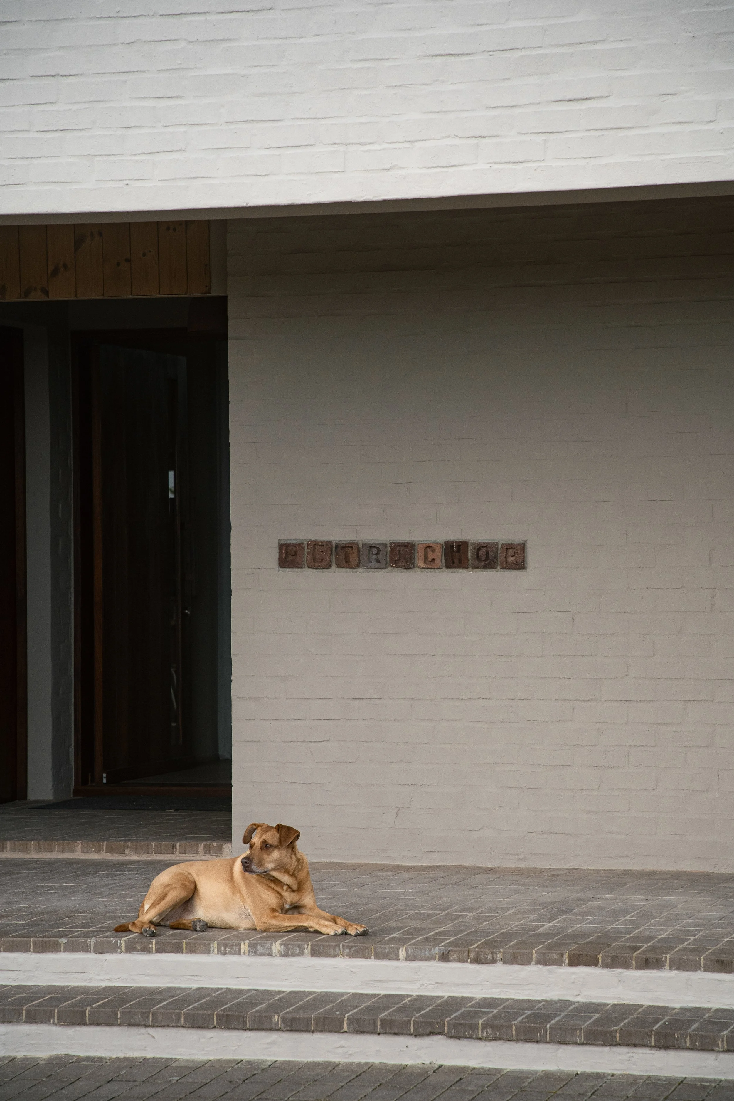
The terracotta letters on the entrance wall that spell Petrichor embody the same philosophy that defines the home itself. Just as Willem Bossof's "Word Woes IV" transforms individual clay bricks into a meditation on language and materiality, Petrichor transforms natural elements into lived experience. Each handcrafted letter carries the weight of earth and intention, pressed into form through heat and human touch—a process that mirrors the home's own creation
The bricks anchor the ephemeral word into permanent architecture, just as the house anchors barefoot luxury into the landscape. Where Bossof explores how words shape meaning, Petrichor demonstrates how materials shape life—both celebrating the tactile, the handmade, and the profound connection between what we create and how we choose to live.
Way-finding
Petrichor's way-finding system embodies the property's philosophy of material honesty and landscape integration. The weathering steel signage—laser-cut in Karbon Slab Stencil—develops its own living patina, the rust blooming and shifting with each season's rain, literally becoming petrichor. Rather than resisting the elements, these markers embrace them, the oxidised surface echoing the terracotta earth and indigenous fynbos while creating a visual dialogue between human intervention and natural process. The cutout letterforms frame the landscape beyond, making the mountains and sky part of the sign itself.
On the entrance wall, Karbon's clean sans-serif geometry provides contemporary clarity against the clean entrance, while the etched metal plaque adds layered meaning through its Latin inscription: "Odor terrae, maiestas montium"—the scent of earth, the majesty of mountains.
Both typeface variants share Karbon's distinctive geometric structure and excellent legibility at distance, essential for rural way-finding, while their contrasting weights create hierarchy without competing voices. The result is a way-finding system that guides visitors not through dominance, but through quiet conversation with place.


